For my startup, I want to add some charts and anlytics to the dashboard. This will help people see what’s going on with a quick glance, and then click to expand into a grid view.
Key metrics
Before I go and build the thing, probably a good idea to plan out what metrics are needed.
Note: it’s based on time period (today, last week, etc…)
- New packages:
select count(id) from shipments where created_at between ? and ? - Delivery rate:
total_delivered / total_shipped - Problem shipments:
stuck_shipments + damaged_shipments + shipments_returned_to_sender
Charts
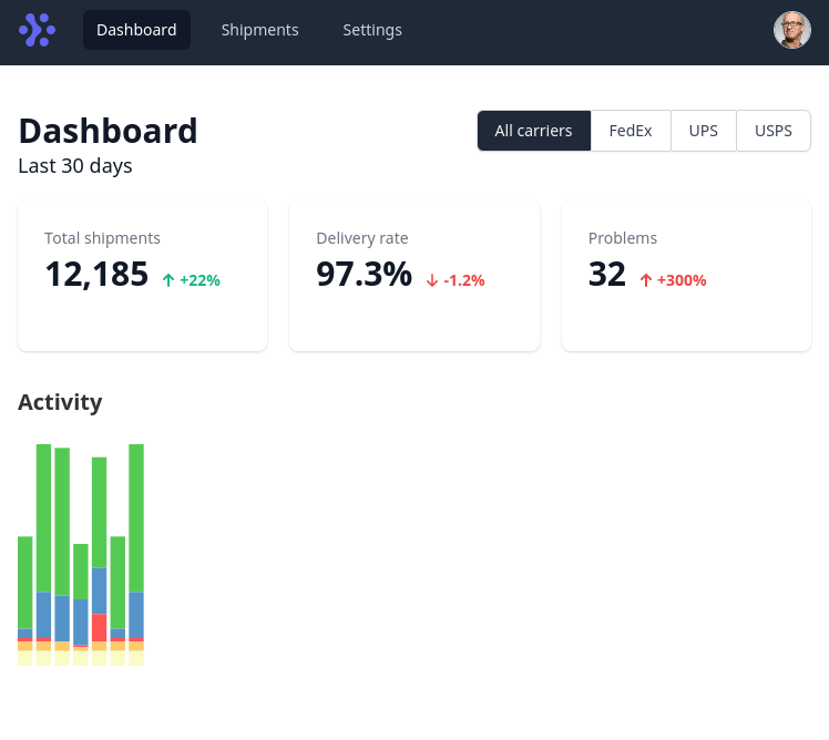
Carts are broken down by carrier in bar chart format:
- Activity: A bar chart by day. Each bar is split by new, delivered, returned, stuck, and grouped by carrier (hide in transit events, theres too many).
- Delivery speed: Shows time it takes for each parcel class to arrive.
Demo
Can’t share the Svelte REPL for this because it contains tailwind-ui (paid product).
Notes
- To compute the time each parcel class takes, it will require storing some more data:
- business days vs calendar days each package took
- parcel class info (UPS 2-day, USPS First-class mail etc..)
- Add a date range picker component
- Build out a backend
- Add tooltip using hover/touch to bar chart
- Add “exception” events to reports