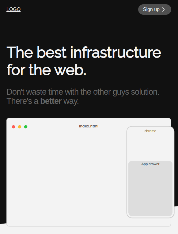
Since I will often test landing pages for developer related things, I figured it would handy to have a screenshot of a phone and desktop screen to display how things work. Likely using animations.
So I added 2 components, called Phone and Screen. They both use slots to wrap the inner content.
<Screen title="screen title here">
  <!-- any content here -->
</Screen>

<Phone title="phone title here">
  <!-- any content here -->
</Phone>
Here’s the code:
Here’s what it looks like:
